
Client: C Cups Espresso
Scope: Logo refinement, complete rebrand, and visual identity development
Objective: To transform C Cups Espresso’s undefined brand into a strong, cohesive, and bold visual identity that reflects their mission, values, and vision for growth, ultimately preparing them for the future, including potential franchising.
When C Cups Espresso approached me with a request for a simple logo refinement, it quickly became clear that the business needed much more than just a new logo. After learning about their aspirations to eventually franchise, it became evident that the foundational work of understanding who they truly were, who their ideal customers were, and what their business stood for was missing. Without this critical understanding, no visual identity, including a logo, would fully capture the essence of their brand.
To create a brand identity that resonated with their target audience, we conducted in-depth marketing research to understand who their ideal customers were, what they valued, and what kind of experience they were seeking. This research provided valuable insights into their customer base—those who craved bold coffee and a high-energy, positive atmosphere. With this information, we were able to craft a brand identity that connected with this audience on a
deeper level.
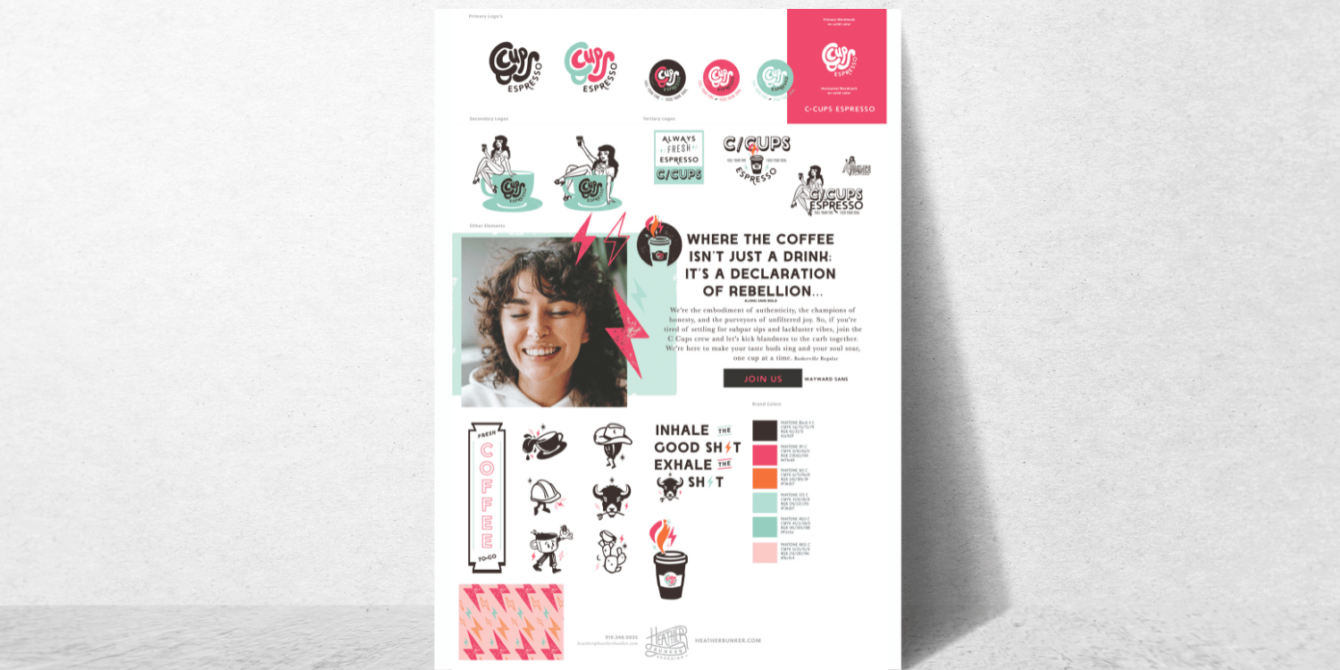
I then guided C Cups Espresso through a deep discovery process where we focused on identifying their core values,
the unique vibe they wanted to evoke, and the experience they wanted their customers to have. We explored their
target audience and how they could best communicate this energy through their brand. Together, we developed a complete rebrand, including a refreshed logo, a unique and fun visual identity, and messaging that would resonate
with their customers.
Once the brand’s core elements were established, I also emphasized the importance of building a strong online presence to increase brand recognition. This included ensuring that the visual identity translated cohesively across both their online and offline touchpoints.

The rebrand completely shifted C Cups Espresso’s identity. The new logo and visual identity reflected the bold, unapologetic nature of their coffee and customer experience. The branding now speaks directly to the audience they want to attract—people who demand high energy, quality coffee, and an experience that’s as vibrant as they are.
The rebrand also allowed C Cups Espresso to develop a clear messaging framework that reflects their values and purpose. "Fuel Your Fire, Feed Your Soul" became more than just a tagline; it encapsulated the energy and mood of the entire customer experience.
Following the rebrand, C Cups Espresso is still working toward increasing its online presence with cohesive visual branding across their website, social media, and marketing materials. It's important that they need to build an online strategy to help them build stronger brand recognition, setting them up for future growth.

The C Cups Espresso project reinforced an important lesson for me and my clients: branding is so much more than a logo. It’s the foundation of a business, influencing how customers perceive you, how you connect with your audience, and how you set yourself apart from the competition. A brand needs to be built on a solid understanding of your values, mission, and target market. When you know who you are, your logo and visual identity can truly come to life.
For C Cups Espresso, it was clear that they couldn’t just slap a new logo on their business and hope for success. They needed a clear identity that matched their bold personality, one that would resonate with their audience and fuel future growth, including franchising. With the right branding and a stronger online presence, they are now on the path to becoming a standout coffee brand.


Ditch the burnout, charge what you're worth, and build a six-figure creative business—without sacrificing your passion or freedom.

